Portfolio
These are just a few of my favorite projects.
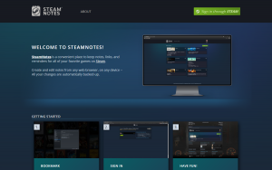
Web Development

Web Design


Branding

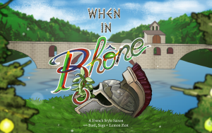
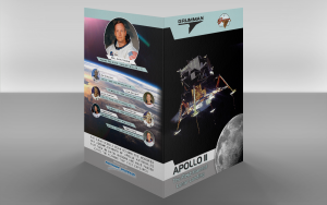
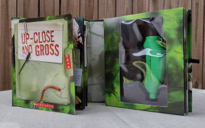
Print Design